Returning to Barcelona Technology School for Two Consecutive Years
- Apr 20
- 4 min read


This post shares insights from the masterclass and reflections on why Barcelona remains a special place.
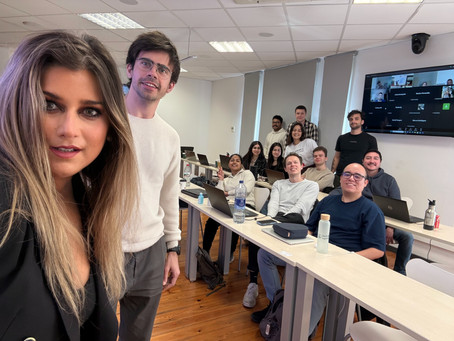
When Barcelona calls, it is hard to say no. I gladly accepted the invitation a second time to present a masterclass on data visualisation. It feels like coming home—not just because of my past visits to Boehringer Ingelheim's offices in Sant Cugat, but because Barcelona holds so many meaningful memories. My goal with each class is to enrich the master's students' understanding and deepen their passion for data visualization. I take mentoring seriously and always include real-life examples from my 15+ years of work experience, highlighting both the positive and negative aspects of this career path.
Each session in Barcelona reminded me that mentorship flows both ways. Students shared their challenges and successes, which helped me understand their world better. What brings me the most joy is watching participants gain skills and apply them in their work is a powerful motivator. It shows that investing time in others creates a ripple effect of growth and improvement. My blueprint was always the Tableau community, which feels like it became part of my DNA.
In the last two years, we have constantly heard about AI and its impact on our jobs, with many people being laid off because AI can replace certain work routines. I was pleased to have the opportunity to discuss this hot topic and engage in heated debates about the future of our industry, what changes are coming, and how we can pivot. This conversation helps me to keep my passion alive.
I truly believe in transparency; communicating our frustrations openly, avoiding gatekeeping, and, ideally, helping each other out are all vital.
Thank you for the invitation, Marina and Mateu!
Storytelling with Data
The practice of visualizing data to aid human understanding dates back to the 19th century. The early pioneers of this field primarily focused on research and healthcare.
I must mention key figures such as Florence Nightingale, Dr. John Snow, and Charles Joseph Minard, who is often referred to as the father of the flow chart. If you find yourself in London, be sure to visit the John Snow memorial, which is located by the water pump on Broadwick Street in Soho. It's not about Game of Thrones!
Data visualization is not just about making charts look good. It is about telling stories with data that anyone can understand. In today’s world, where information overload is common, clear visuals help people make better decisions quickly.
Data storytelling goes beyond data visualization to create a narrative that connects the data to the audience. Involves using data to tell a story, such as identifying a problem, presenting evidence to support a solution, and providing a call to action.
Effective data storytelling requires combining data analysis, data visualization, and storytelling techniques to create a compelling narrative that resonates with the audience.
During the masterclass, I emphasized these key points:
Clarity over complexity: Simple visuals often communicate ideas more effectively than complicated graphs. Choose the right chart.
Let's dig into UX/UI principles! They can help us tremendously in achieving a top-notch dashboard by following the researchers' insights into human behaviour.
Context is crucial: Data without context can mislead. Always provide background to help viewers interpret visuals correctly.
Audience matters: Tailor visualizations to the knowledge level and interests of your audience. Always ask if someone has some visual impairment or color blindness. Test your creation on real people before releasing it to the wild. Always follow up and request ongoing feedback.
Use color and design thoughtfully: Colors should highlight important data, not distract from it.
Declutter.
Wireframe and Prototype your dashboards. Helps you create templates and give a signature and unified look to the company dashboards.
Data & Metrics Dictionary. Document your work and calculations.
These guidelines are easy to implement but make a big difference in how data is perceived and understood.
The Personal Impact of Returning to Barcelona
The city's energy fuels my creativity. As I walk through its streets, I find inspiration in the blend of tradition and modernity. Biking along the beachfront is a priceless experience. This vibrant atmosphere carries over into the classroom, where students bring fresh perspectives and new energy to this millennial like me.
I feel fortunate to have the opportunity to connect with friends in various industries, from data to pharma and healthcare, as we share the latest trends and hot topics. Barcelona is bringing the numbers that other big cities only dream about. GDP grew by 3.8% in 2024 and 2.7% in 2025, with 1,241,853 people employed as of March 2025. *
Barcelona has become a major hub for high-value sectors. Startup and scale-up investment grew by 43% in 2025, totaling €517 million. A major growth area, with the BioRegion attracting €2.382 billion between 2021 and 2025.**
I always leave feeling inspired—motivated to pursue what I truly love. I enjoy working with amazing, like-minded people who are doing exciting things with data, alongside doing a bit of sailing and diving. Barcelona has rekindled my passion for art and painting, and I'm very grateful for this year's trip. Is it the sea, the architecture, or the wonderful people? Whatever the reason, it truly works for me.


Comments